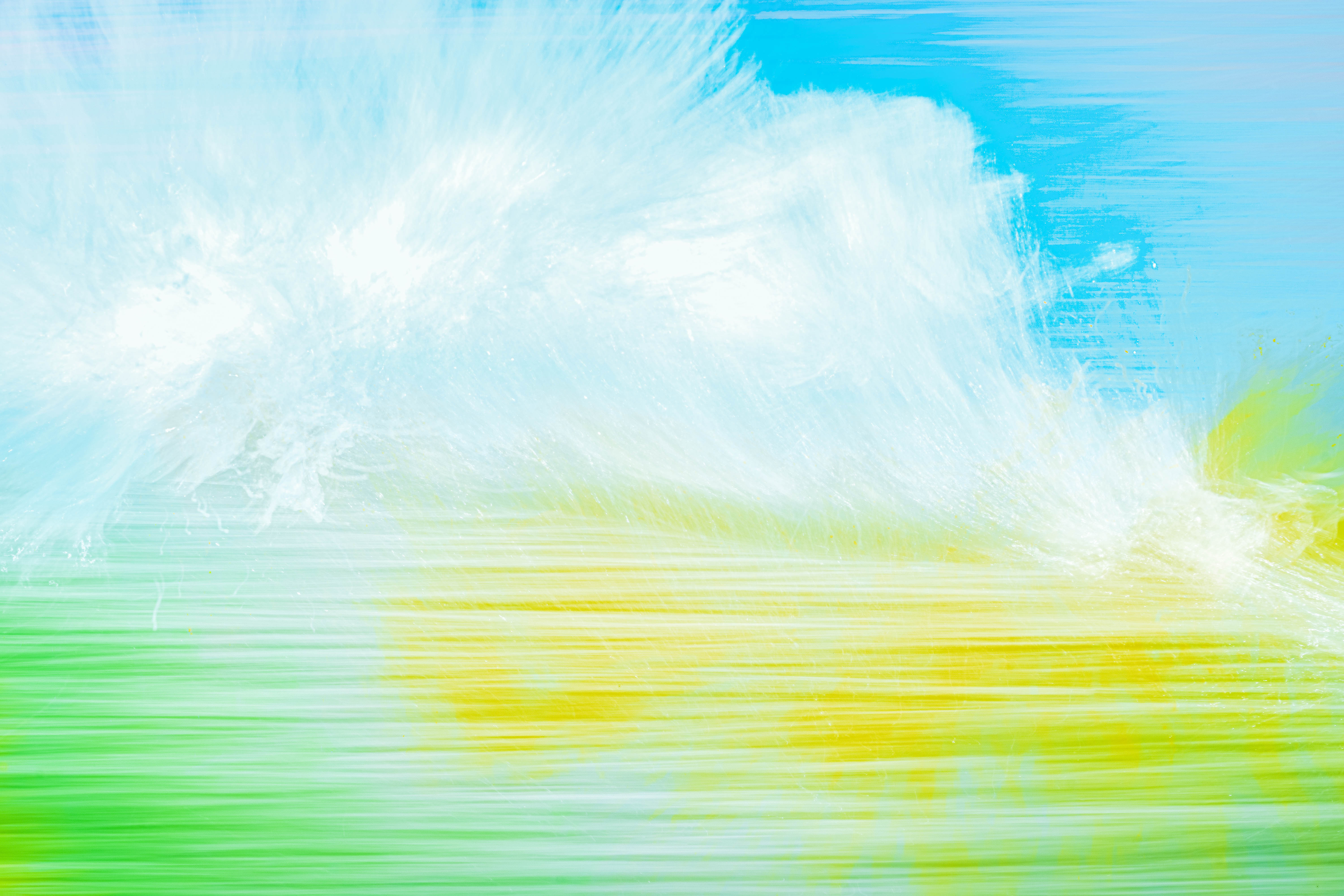
Waves
These seascape are abstractions of water, motion and light.
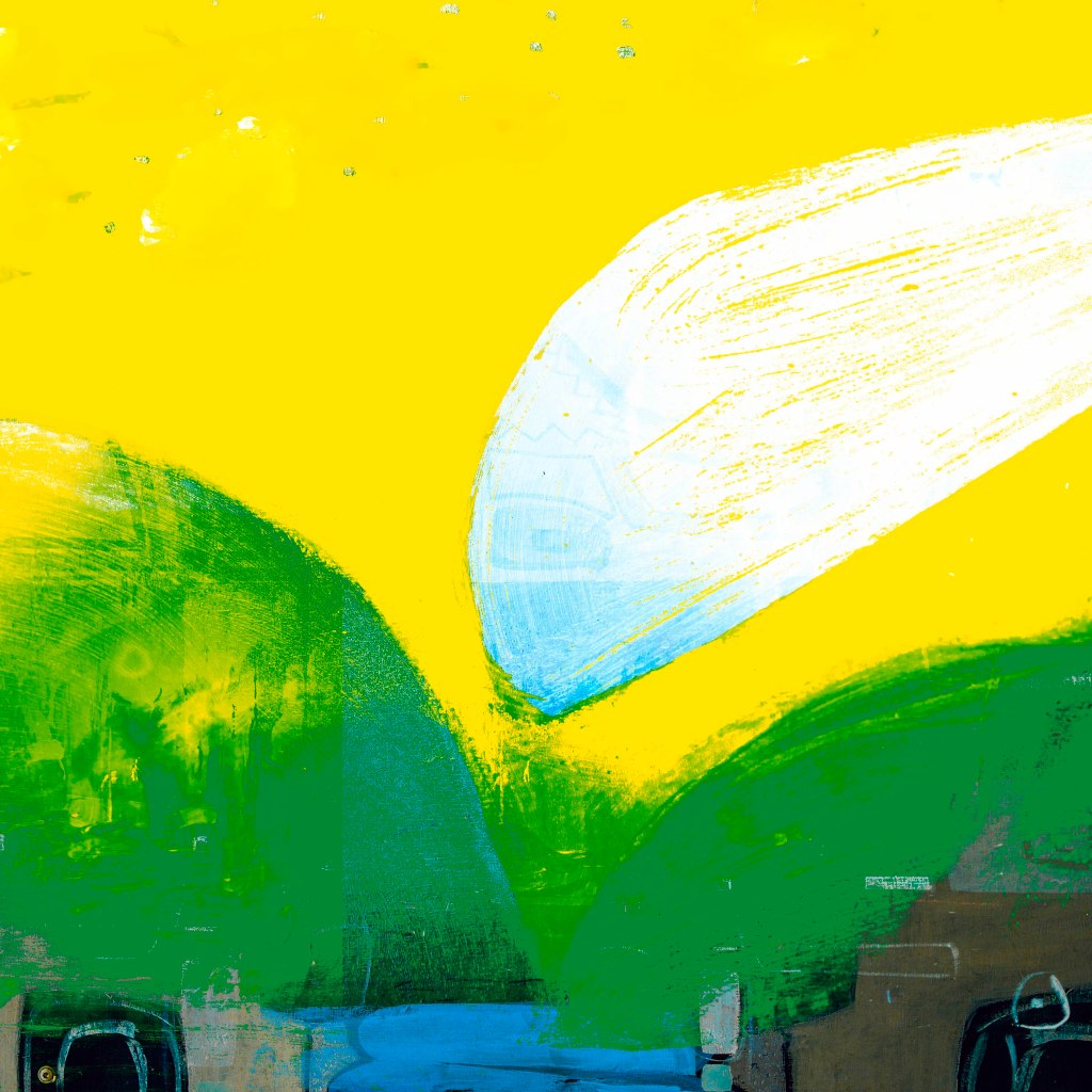
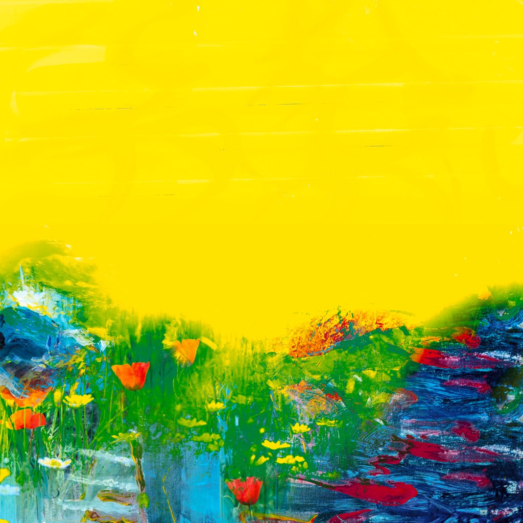
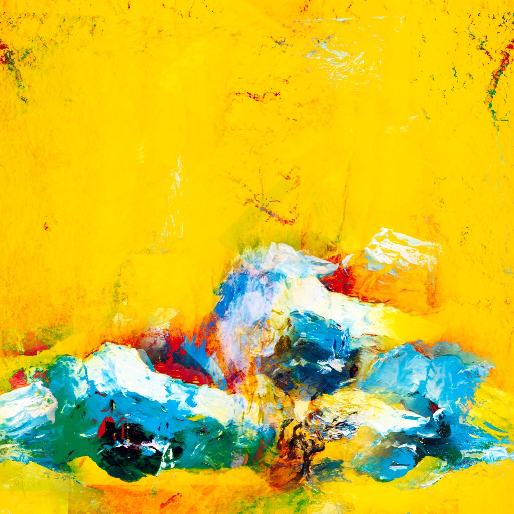
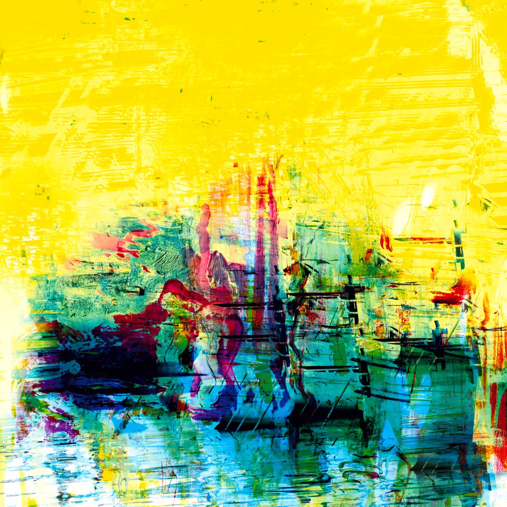
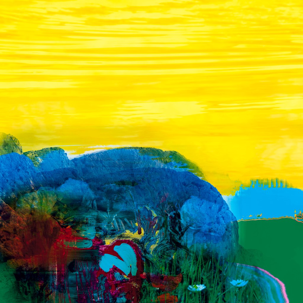
Provence
Inspired by the golden light in Provence this series uses multiple photographs taken in 2025 using Avignon and Aix-en-Provence as bases. Influences are Cezanne and Van Gogh. Anything upto 7-8 photographs are combined using water, landscape, graffiti and various details to re-imagine the landscape the way I see it.
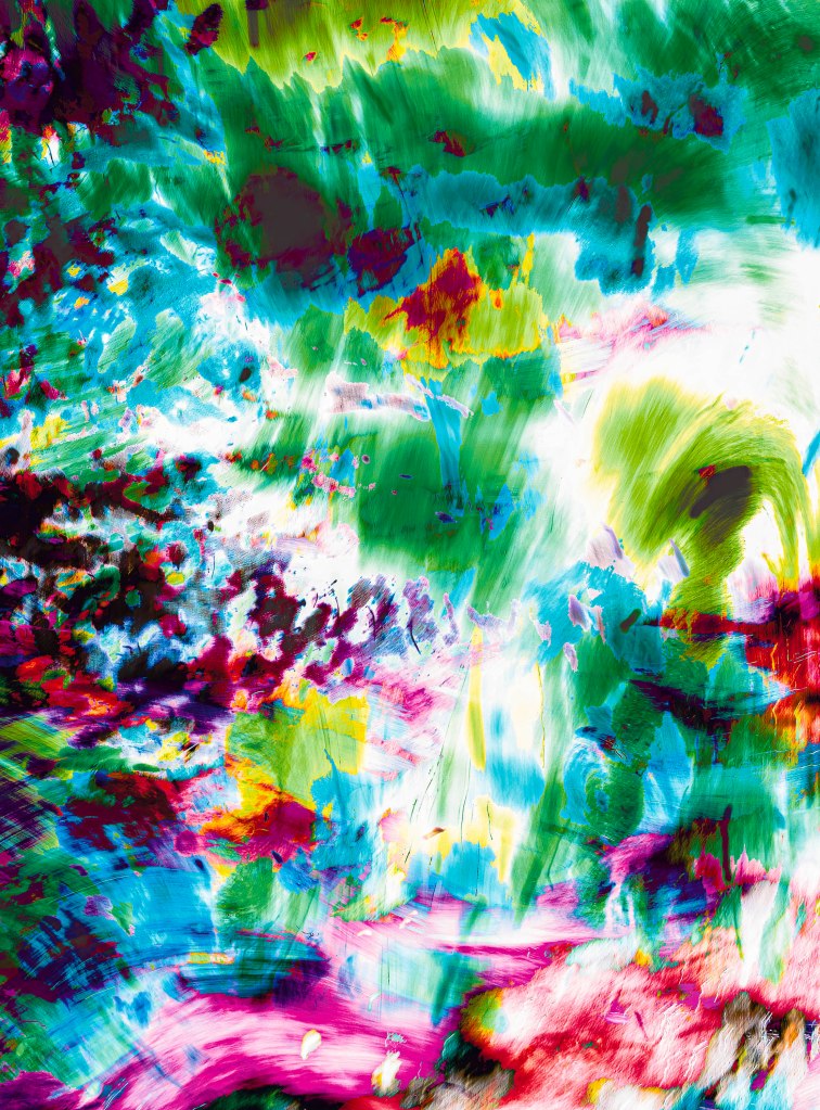
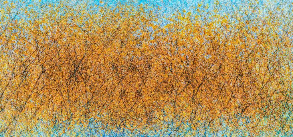
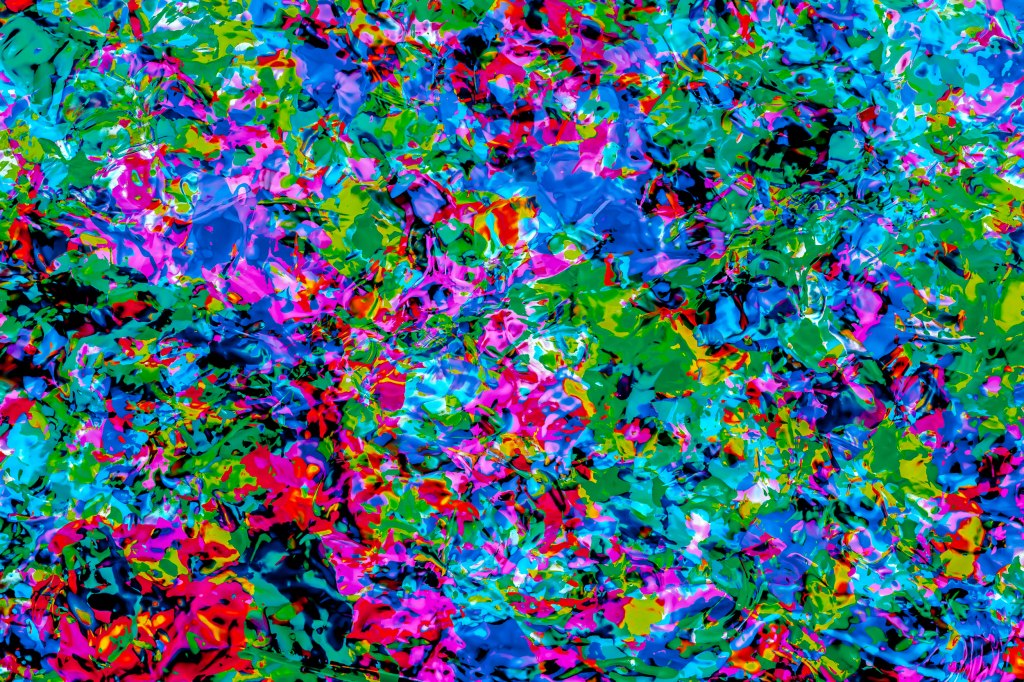
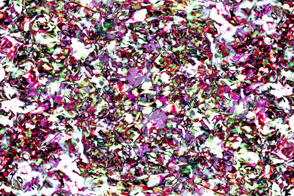
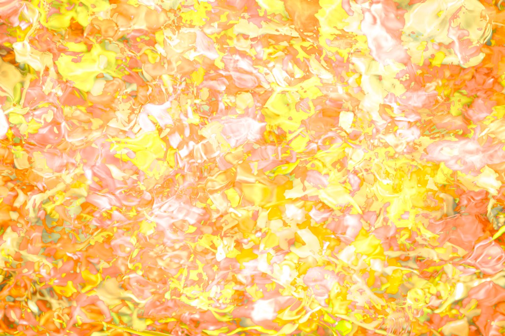
Abstract Landscapes (ongoing work)
“Colour in itself expresses something, never mind the subject” Van Gogh. This work is related to another body of work, Minimal Landscapes. Like that work I seek to interpret the landscape both visually and emotionally. The work is influenced by the American school of Abstract Expressionism with Mark Rothko just one influence among a group of artists that also include Clyfford Still and of course Jackson Pollack. What interests me particularly about this particular ‘ism’ is the way that art became distanced even further from reality and became completely abstracted to colour and emotion. The Impressionists (and the brief Fauvist period) too explored colour in new and bold ways of course, but the subject is always identifiable and with Abstract Expressionism it isn’t. Photographically I find ‘paint’ artists the most inspiring of all and whilst I prefer not to use the rather clichéd concept of ‘painting with a camera’, I do enjoy the effects created by multiple exposure; something I learned by accident years ago when using a Voitlander folding camera circa 1926. I simply forgot to wind the film on!
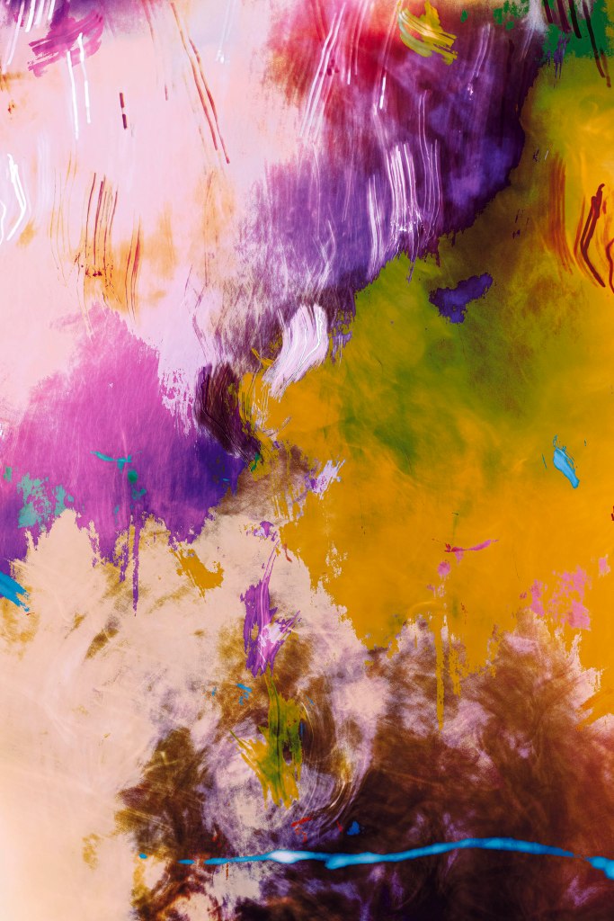
De- Constructed Landscapes ongoing work)
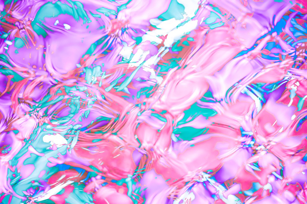
The way we see colour varies from person to person and it is believed some people can see colours just outside the human visible spectrum. Many artists interpret colour as they wish and have no concern for accurate colours in their work. The Fauves are a case in point, and Piet Mondrian’s The Red Tree (1908) and André Derain’s The Turning Road, L’Estaque (1906) demonstrate a complete disregard for realism. This approach in art is often considered audacious and visionary. Photography too can interpret the landscape beyond replication, colour can be subjective and invite alternative narratives.
The repetitive nature of the grid is open to interpretation, for example Any Warhol’s Campbells soup cans (1962) and Marilyn Monroe multiple screen-prints. Originally conceived, and sold, as individual pieces, Campbells soup cans have greater impact in a grid, every can is slightly different. Pre-sold pictures were bought back, the actor Dennis Hopper proving the most resistant to returning his picture.
The sky appears blue to the human eye as the short waves of blue light are scattered more than the other colours in the spectrum, making the blue light more visible. Red skies in the morning and evening are caused by light waves having to travel further through the Earth’s atmosphere and the blue, shorter waves, are scattered and rescattered (Rayleigh scattering) allowing longer red wavelengths through. High pressure air mass also will trap particles like dust (or pollution) which further scatters blue light allowing red to dominate.
This body of work is a further exploration of how we view and use the landscape. Once people inhabit an area of land they start to divide, alter, abuse or seek to enhance – to de-construct.

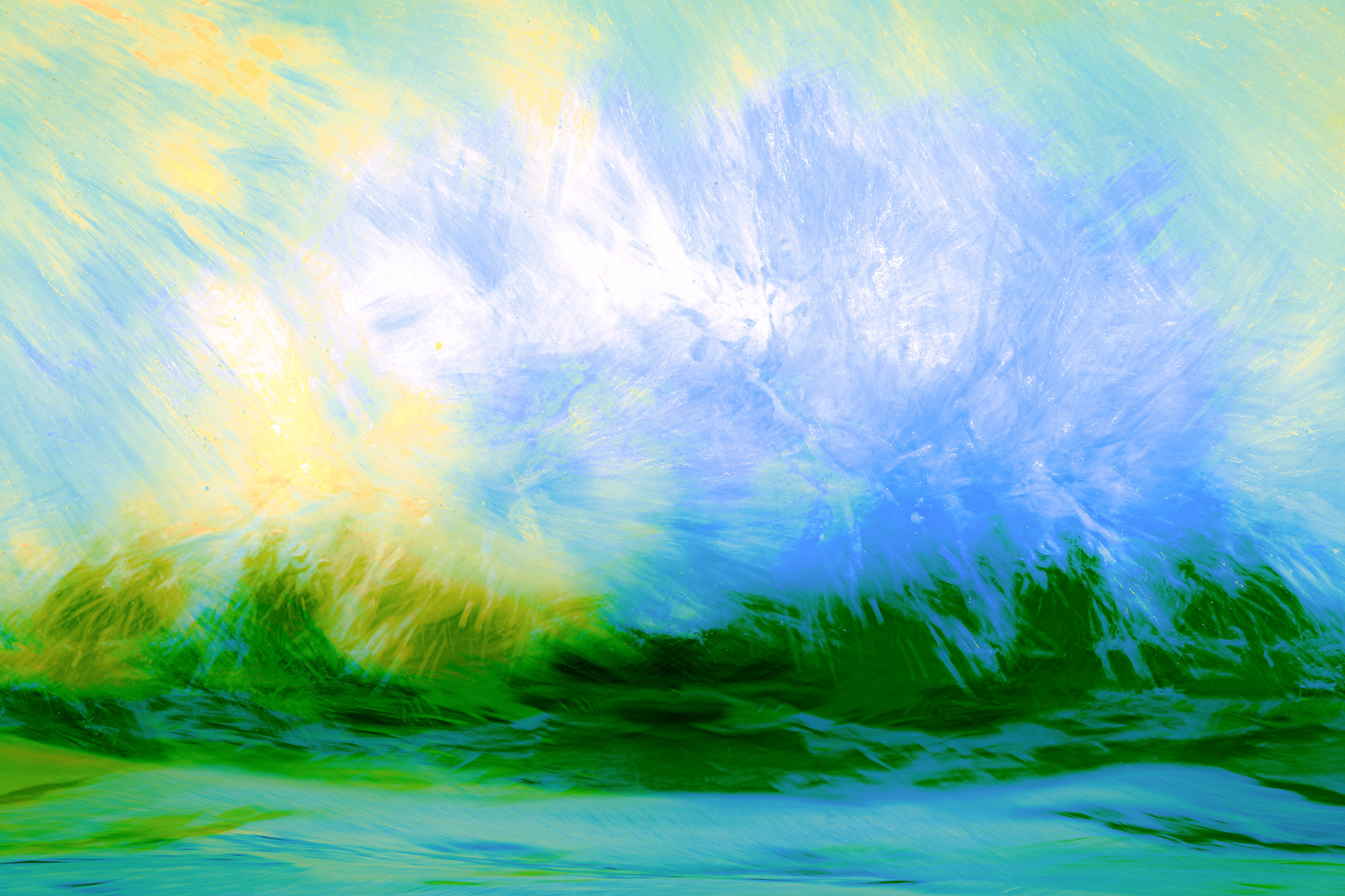
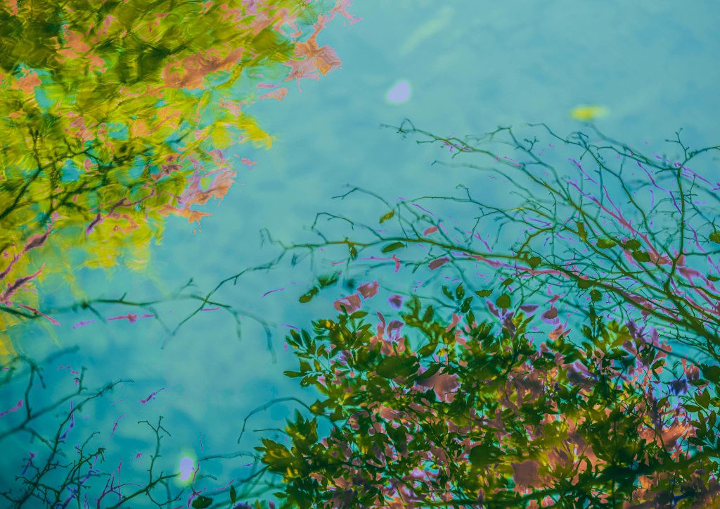
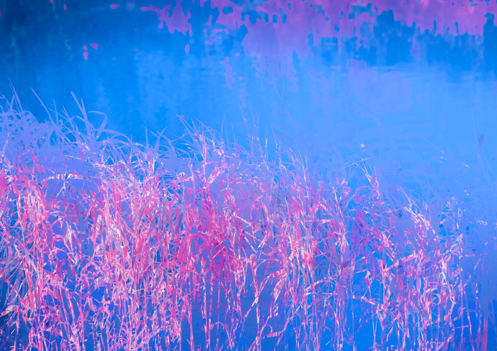
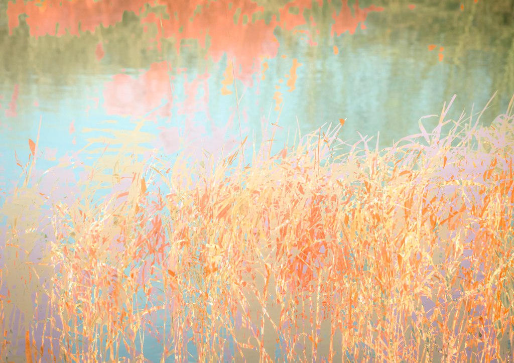
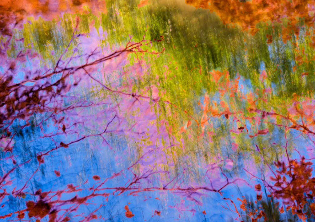
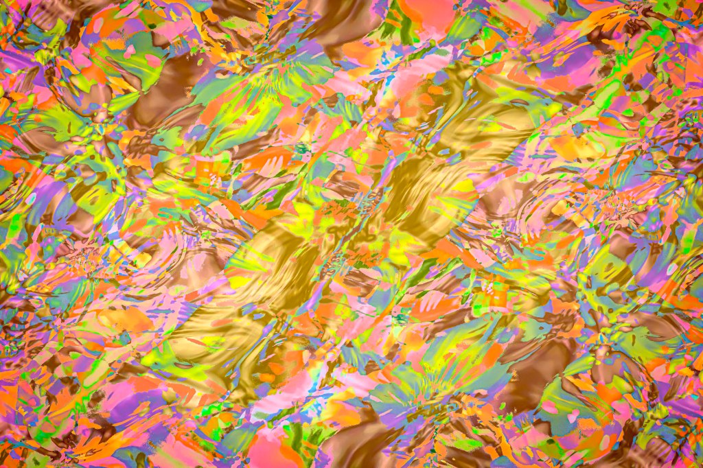
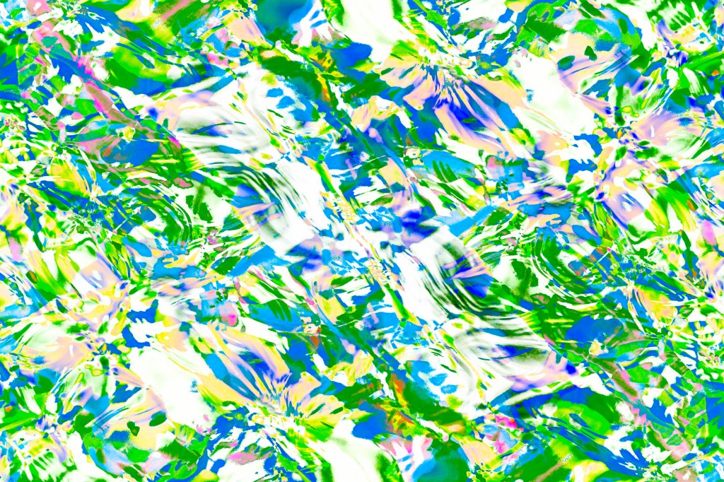
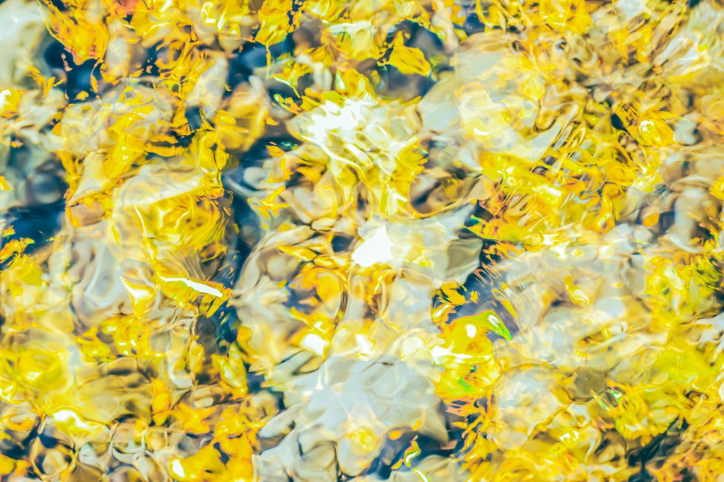
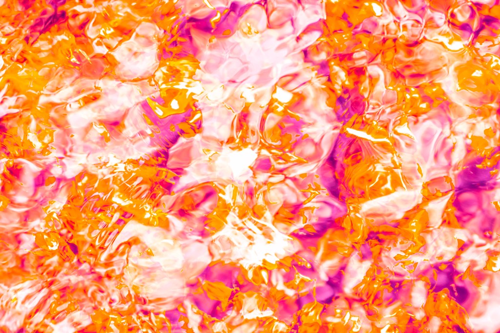
Water (ongoing work)
Seas, rivers, lakes, ponds, streams, rivers, ice, mist, fog, clouds; water surrounds us. In fact quite a lot of it is inside us too, about 60% of our adult body mass with the brain and heart composed of 73% water, lungs 83%, skin 64%, muscles and kidneys 79% and even our bones contain 31% water.
Water (at least that which is not inside us!) provides rich opportunity for interpretation for artists, from Monet’s Water Lilies, Hokusai’s The Great Wave off Kamagawa to David Hockney’s A Bigger Splash.
But aside from romantic ideas around water there is a dark side: England’s rivers are contaminated by a “chemical cocktail” of sewage, agriculture and road pollution, according to MPs. Microplastics, slurry, car tyre particles, oils and wet wipes are all part of the problem, MPs said. High quality water is essential for our survival and that of the environment. Each person in the UK uses around 140 litres of water a day for washing, drinking and cooking. Contamination also threatens water sources crucial for the survival of wildlife, the natural environment and the food system. According to the Wildlife Trusts, rising pollution levels place 10% of freshwater and wetland species at risk of extinction. In Wales and England, 38% of fish health checks are failed, due to disease caused by pollution.
The main causes of pollution in the UK are excessive use of fertiliser and pesticides in agriculture – which is responsible for 40% of water pollution in England, untreated sewage released by water companies – responsible for 35%, “run-off” from roads and towns which contains pollutants such as oil – responsible for 18%.
This ongoing series of photographs which are mostly made in camera use multiple exposure, intentional camera movement and white balance shifts to create other-worldly abstractions of water, light, refraction and reflection to encourage a dialogue around water and how we look after it.
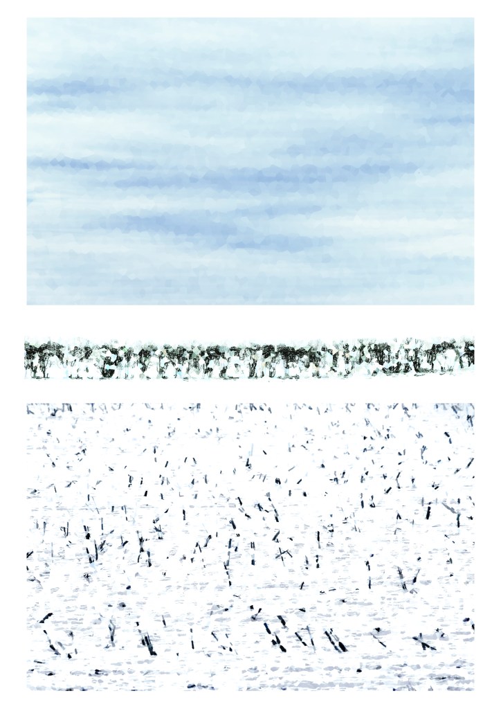
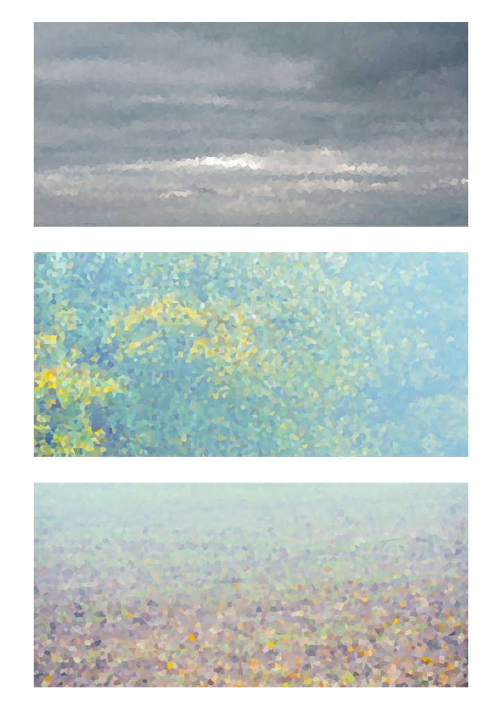
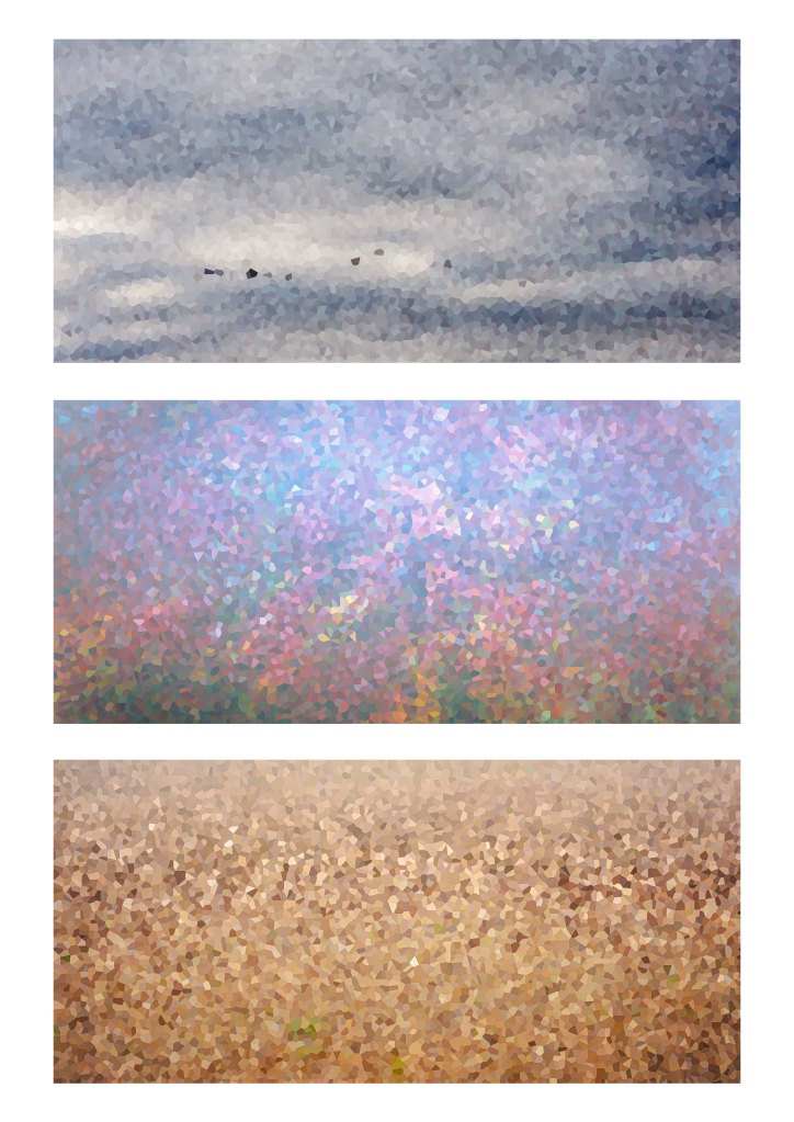
Minimal Landscapes (ongoing work)
The land where I live in Leicestershire is relatively flat heathland long converted to farmland, mostly agricultural with an often dreary landscape. Much as I like to travel I am only able to do this intermittently, which means most of my photography is close to home. As I like to walk and take the dog with me this limits to a radius of approximately 10 miles.
Seeking to photograph this landscape in a fresh, creative way, an attempt to describe what I see and feel, led me to this work. I decided to photograph foreground, middle ground and sky and then assemble into a vertical triptych. I further sought to reduce the detail to colour and pattern and there were several influences for this. The Impressionists, Paul Cézanne’s Mount Sainte-Victoire view from Louvres (1904), and the almost pixilated brushwork effect created by Paul Signac in Capo di Noli (1898) were a start. George Seurat the creator of Pointillism, La Seine à la Grande-Jatte (1888) and Bridgit Riley’s homage to Seurat, Pink Landscape (1960), are all influences although the work is perhaps more object, rather than colour, separation. The prints, much like impressionism look different when viewed closely, or from a distance. I am also drawn to the work of Mark Rothko and other colour field artists of the Abstract Expressionist period including Ad Reinhardt, Josef Albers and Hans Hofmann. I did discover the work of another artist, after I started this work, Brice Marden. Marden’s ‘For Pearl’ (1970), a vertical triptych of blocks of colours representing the south of France. Originally called ‘A Mediterranean Painting’ Marden changed the name following the death of Janis Joplin.
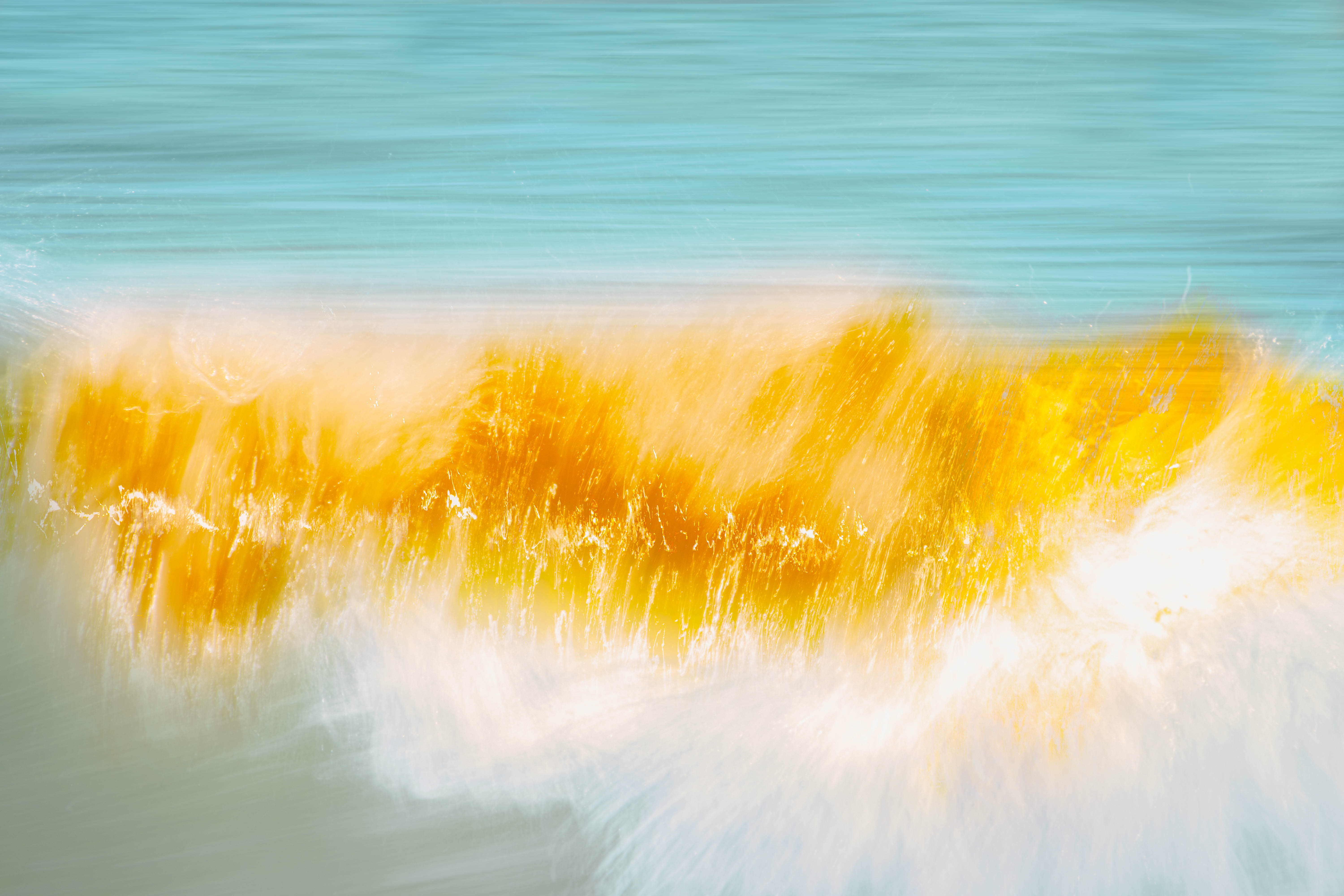
Water II
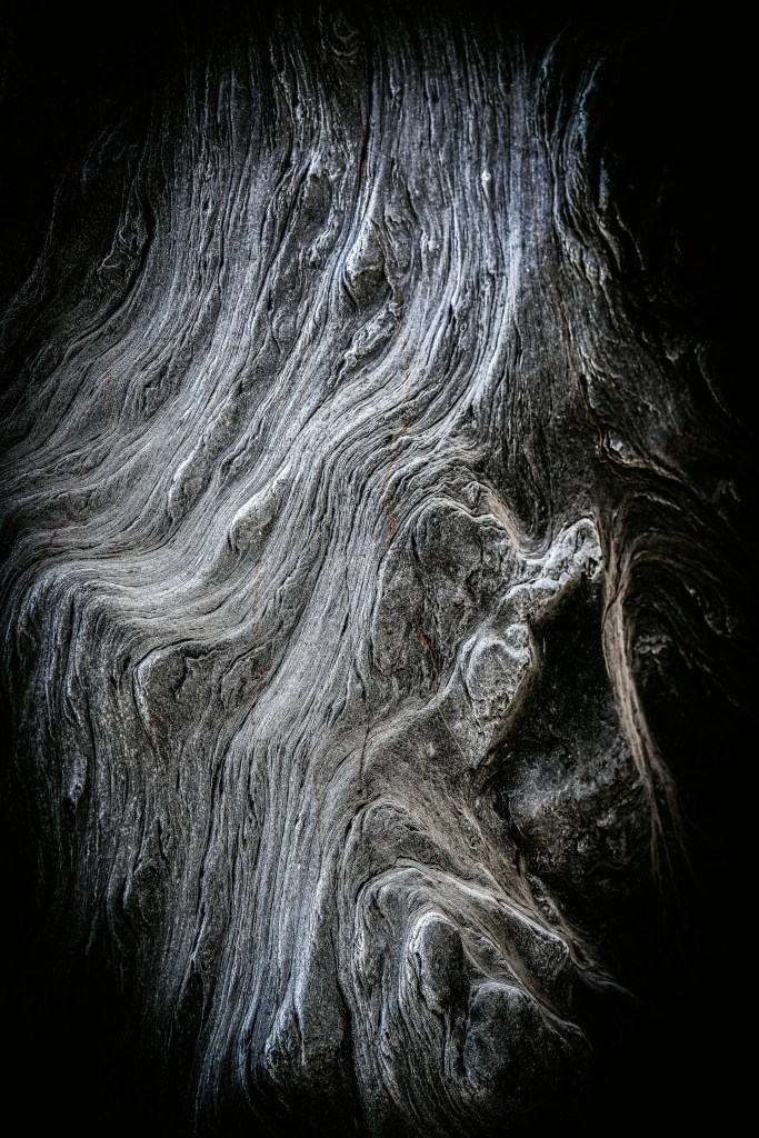
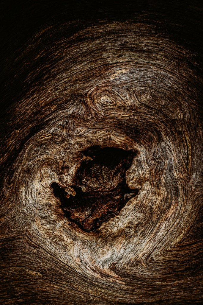
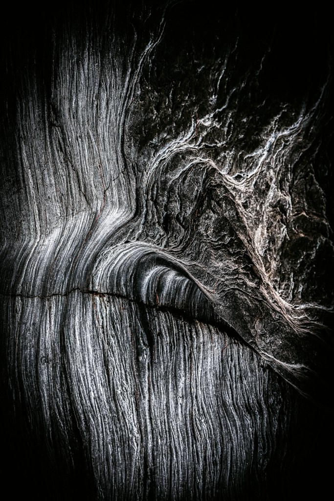
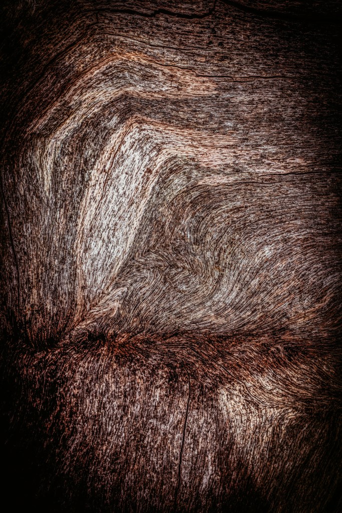
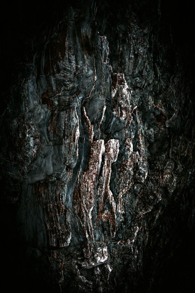
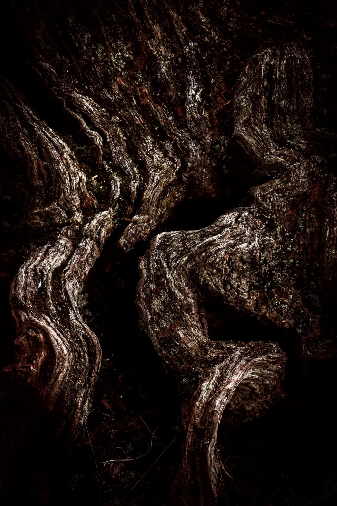
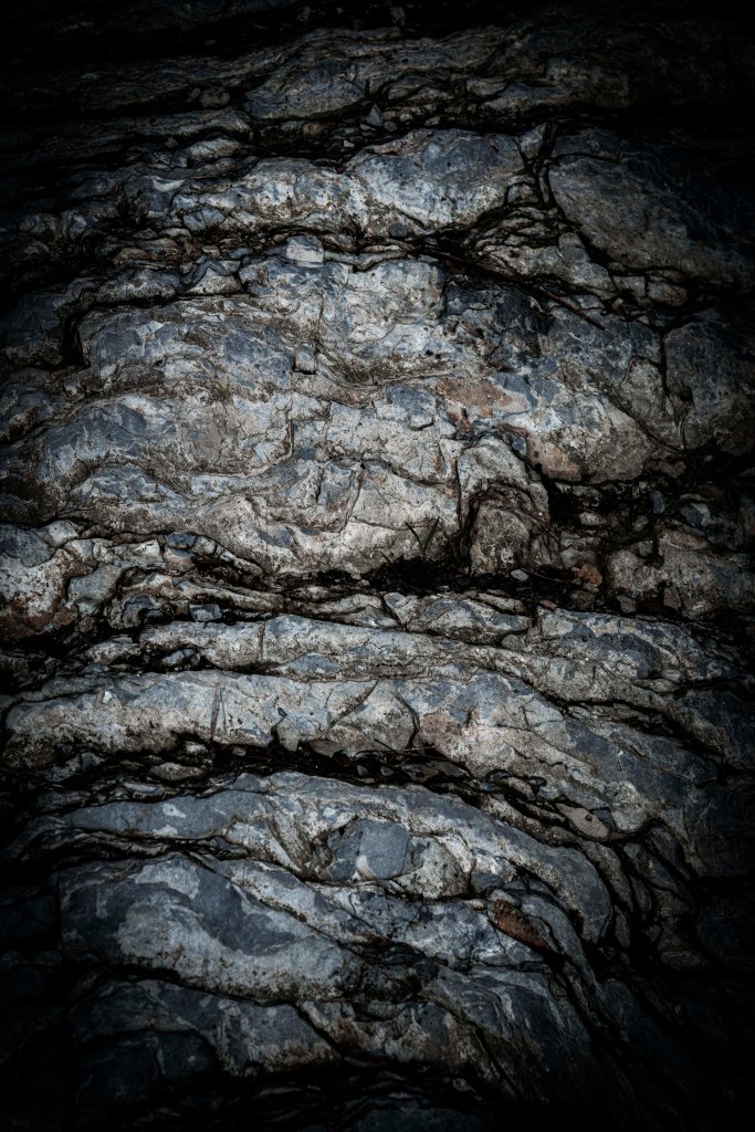
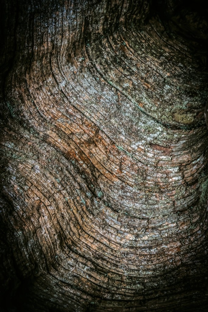
Wood & Rock (ongoing work)
An exploration of detail in the landscape. Searching out rock and wood with interesting textures and contours becomes a very tactile experience. Each surface must be touched to gain a sense of age and history, elements that hold the land together. Working mainly with a macro lens I am able to emphasise fine detail and blur the boundaries (in some cases) between rock and wood. Use of chiaroscuro popularised in the Renaissance and Baroque periods by artists such as Rembrandt and Caravaggio, create mono-chromatic images with richness and depth.
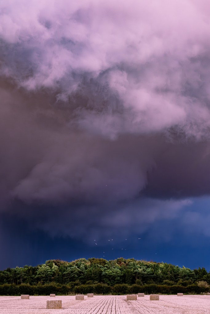
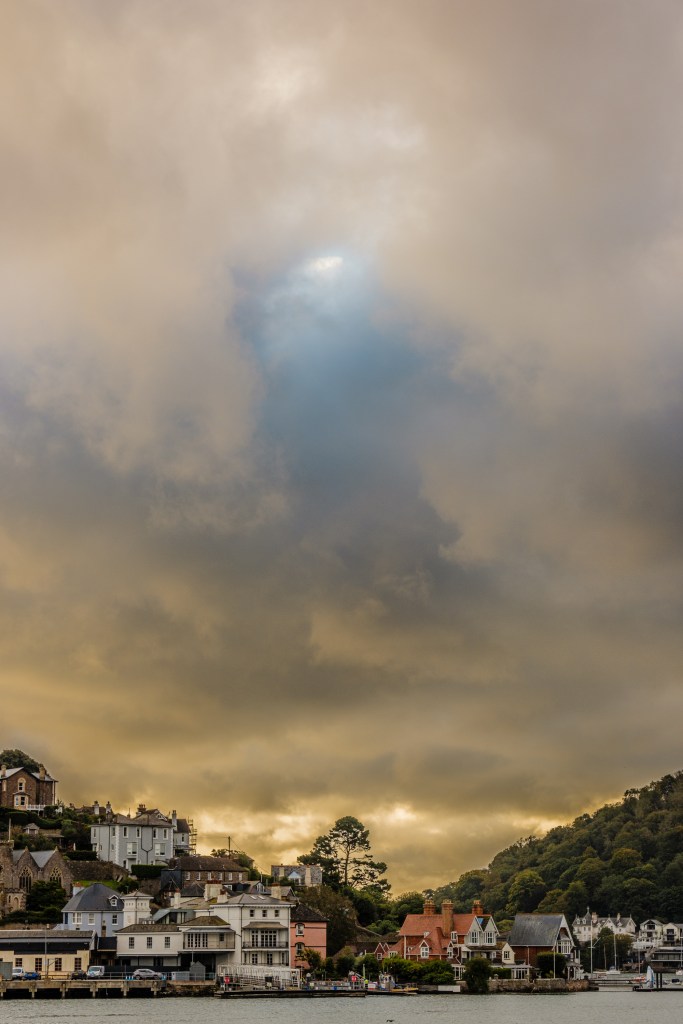
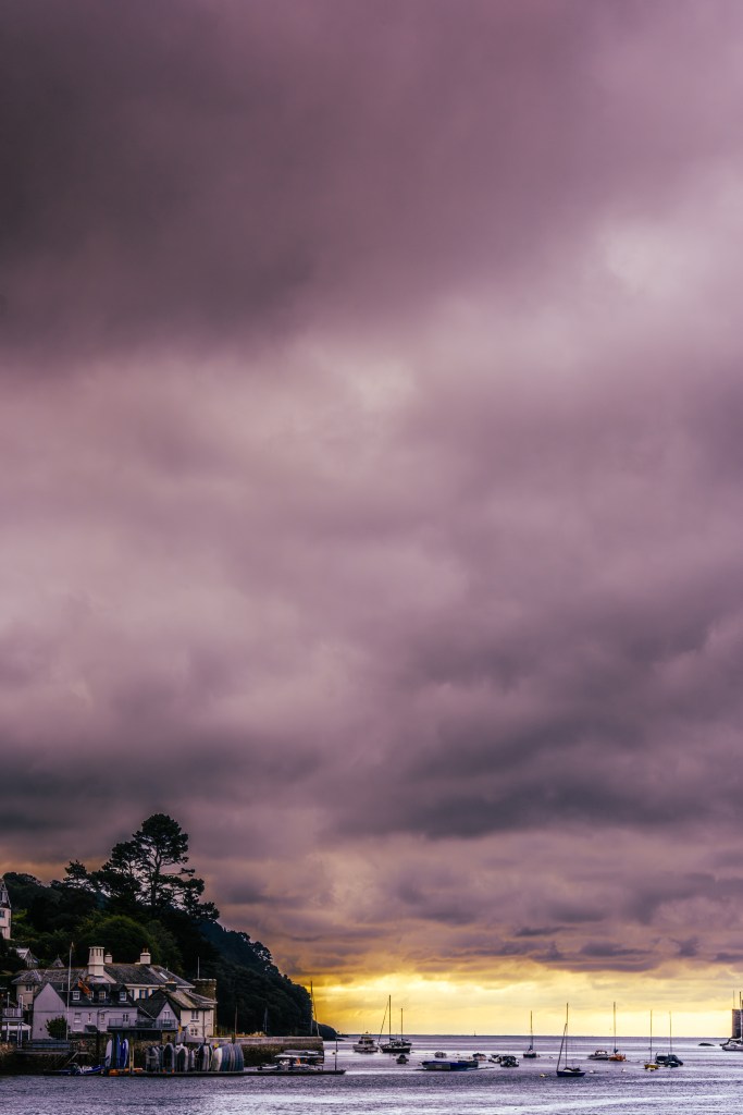
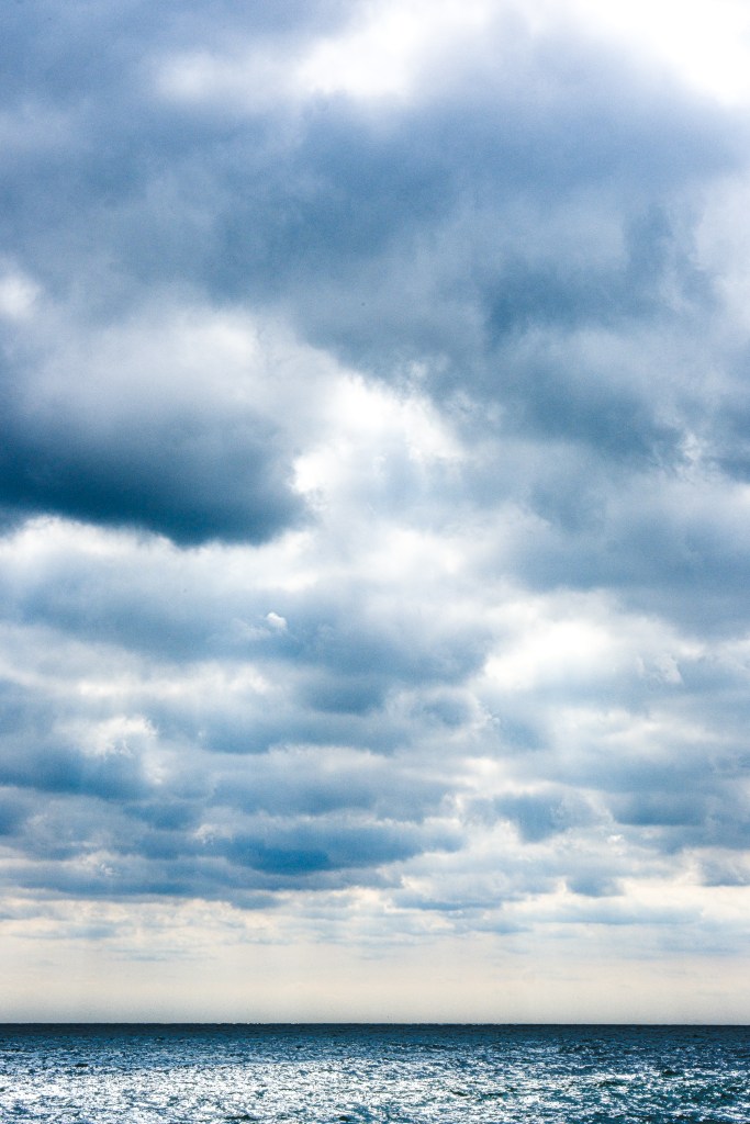
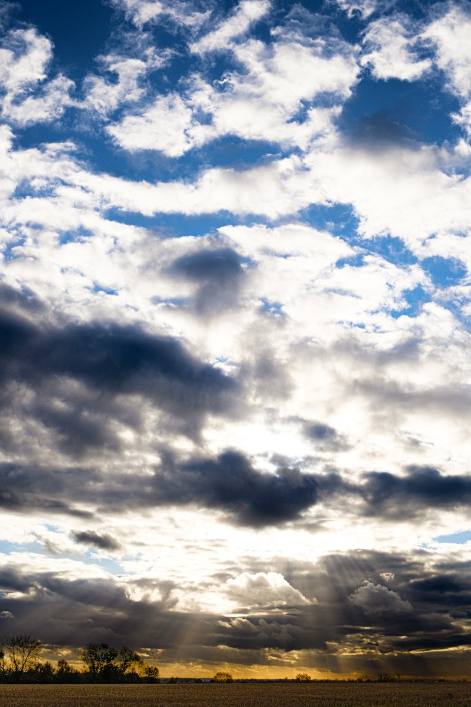
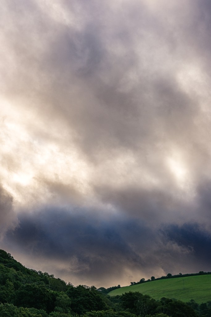
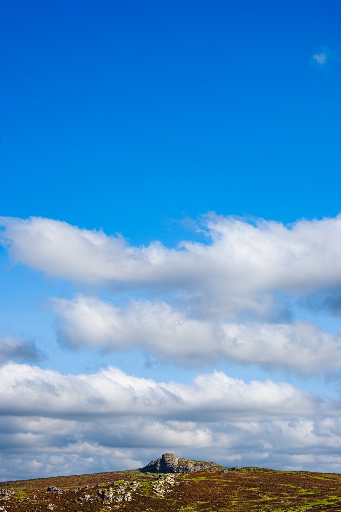
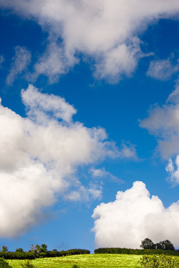
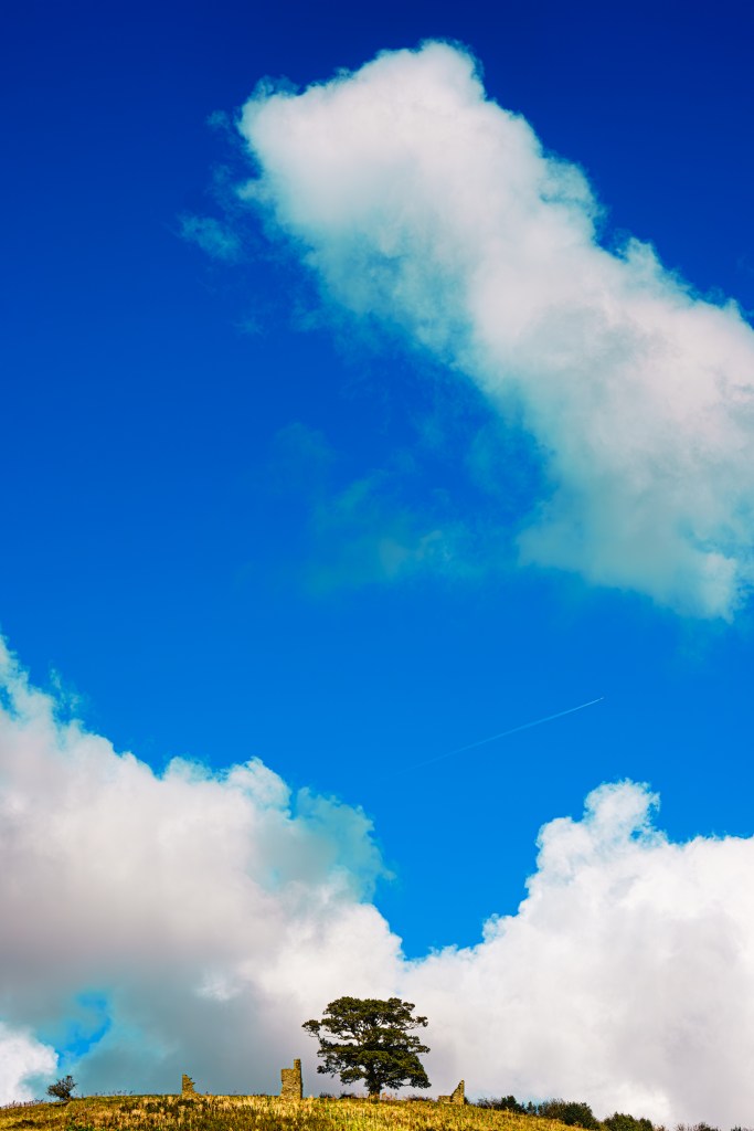
One Sky (ongoing work)
A dramatic thunderstorm making its way over the village was the inspiration behind this body of work. The bruised clouds, dramatic light and seagulls riding the base of the cumulonimbus with hale bales in the foreground made a photograph I was pleased with. I managed to stay dry too.
Editing the photograph made me realise how automatic it is to photograph square or landscape. I also felt I might be missing an opportunity, why not make the sky the focus of the photograph, relegating the land to the bottom quarter or less. The sky is immense, constantly changing yet unites us as humans; we have always looked up in wonder and tried to visualise what lies beyond our field of vision. And photographing portrait arguable puts the sky / land in a more correct ratio. A feeling of sublimity is induced, much like Casper Friedrich’s The Wanderer above the Sea of Fog.
The Cloud Appreciation Society has provided a useful resource for identifying different clouds.
https://cloudappreciationsociety.org/cloud-library/
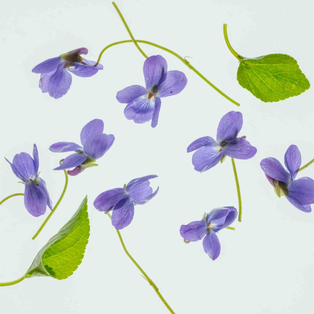
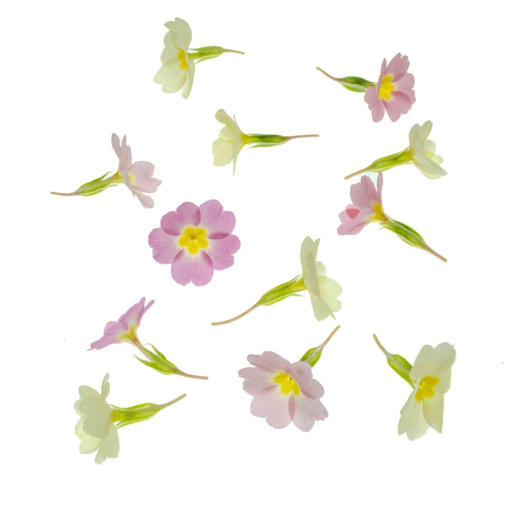
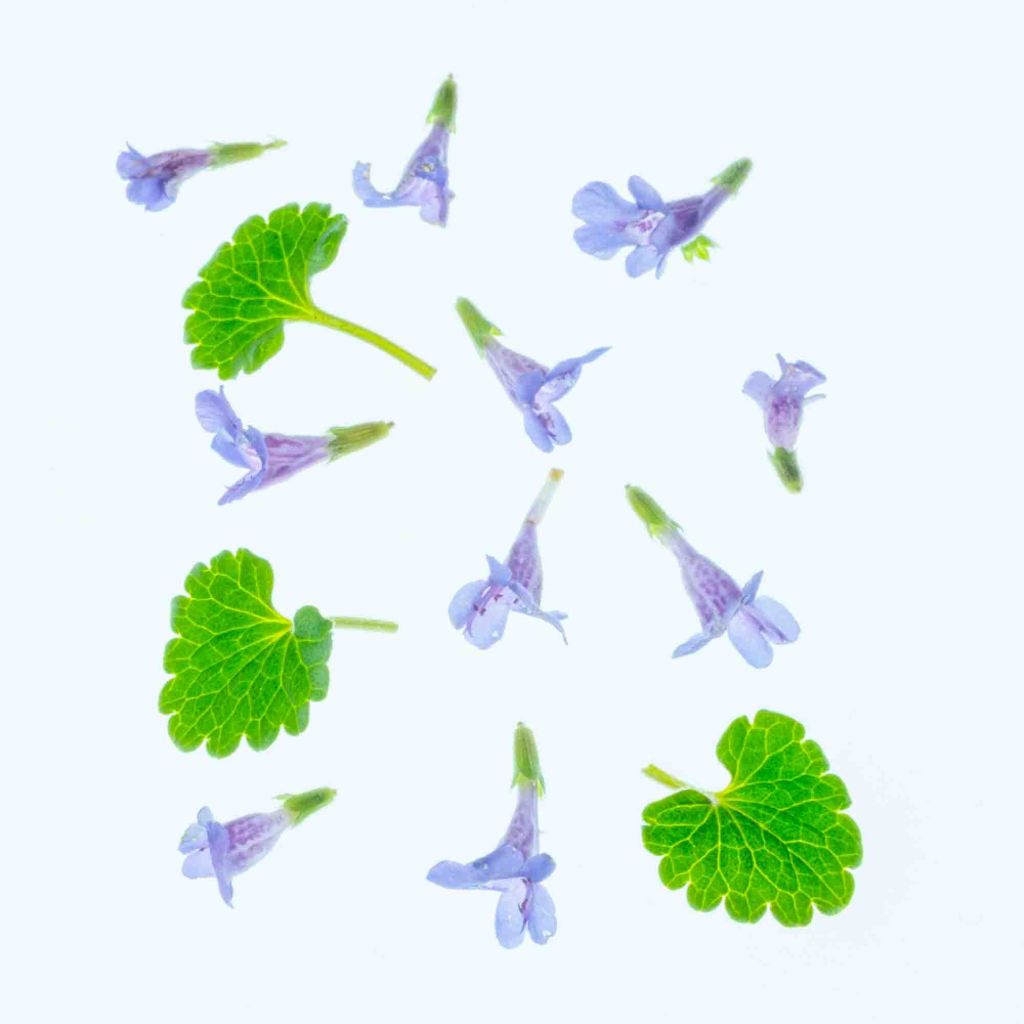
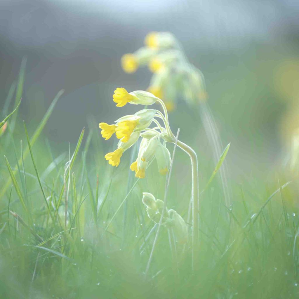
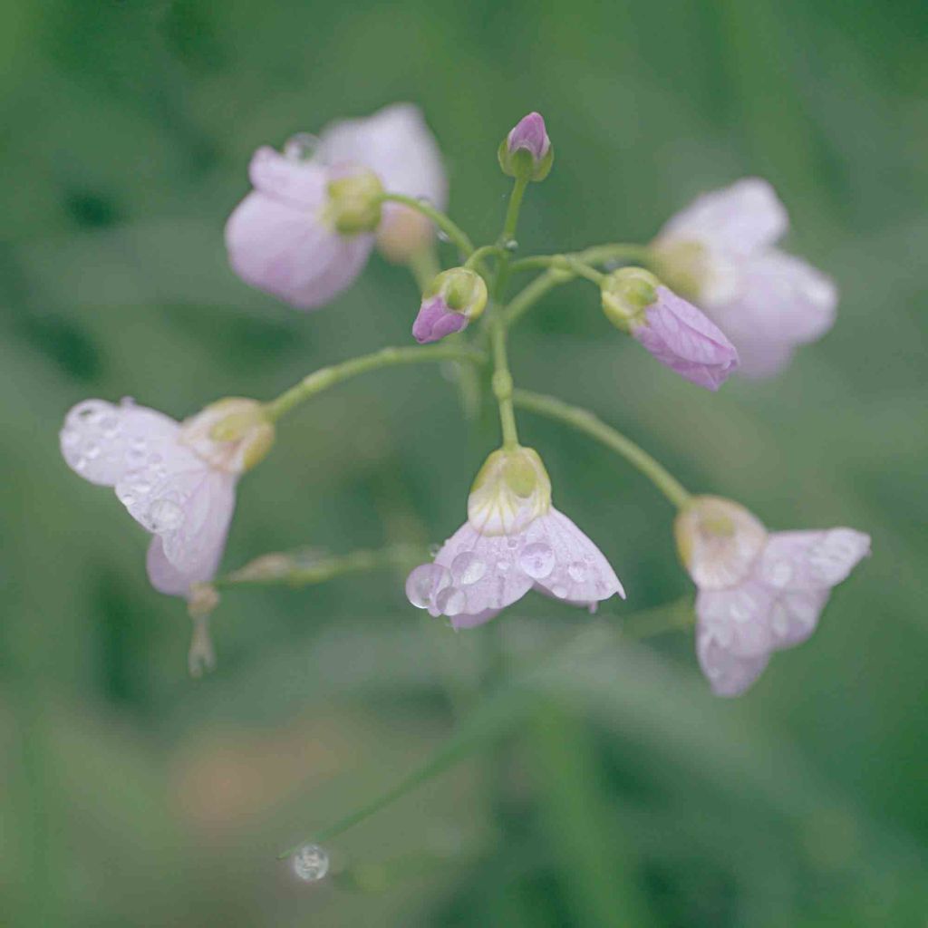
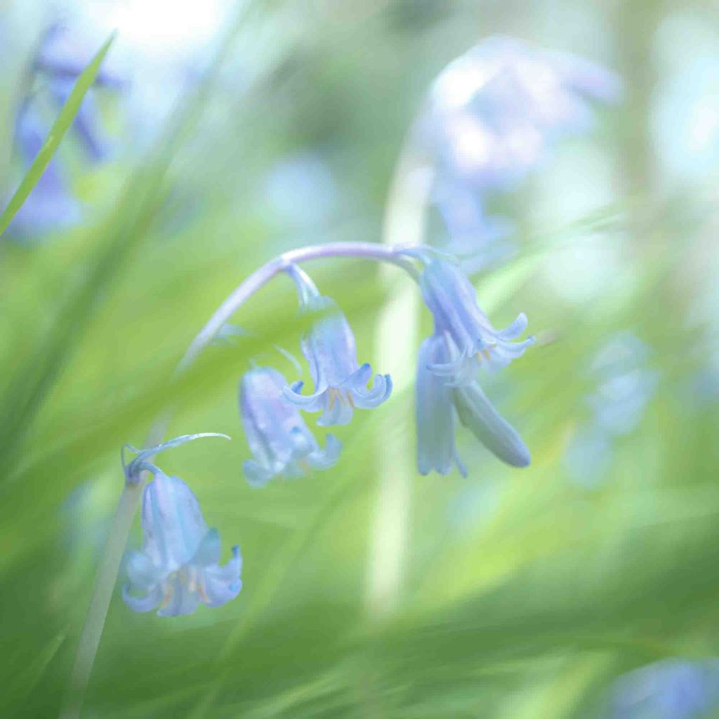
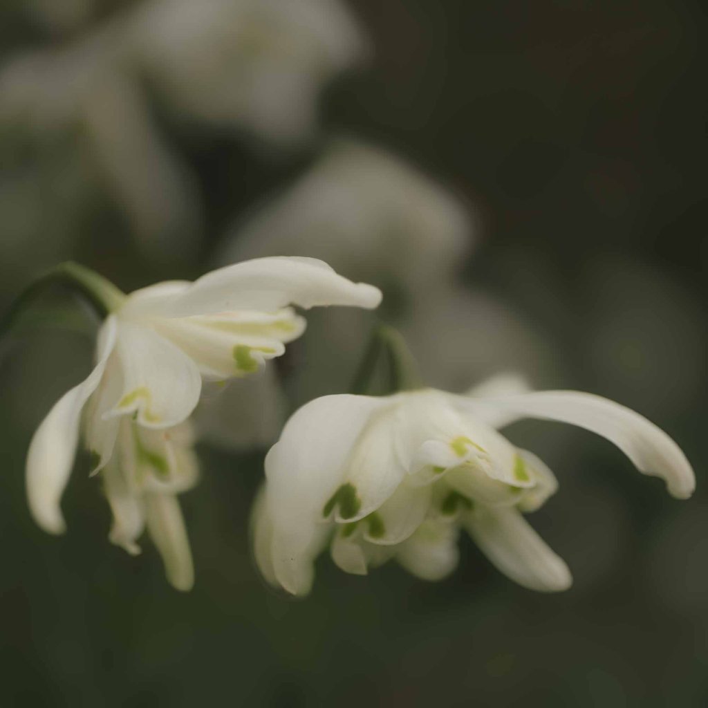
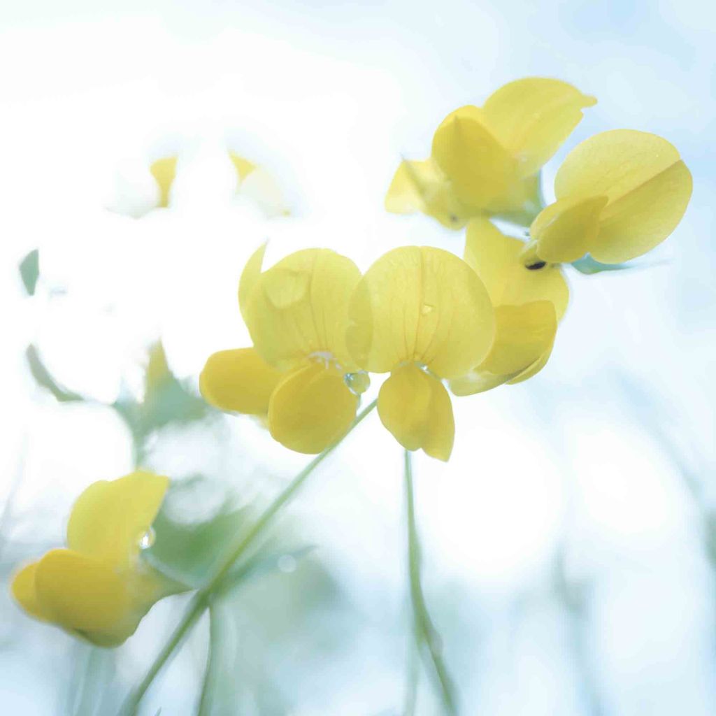
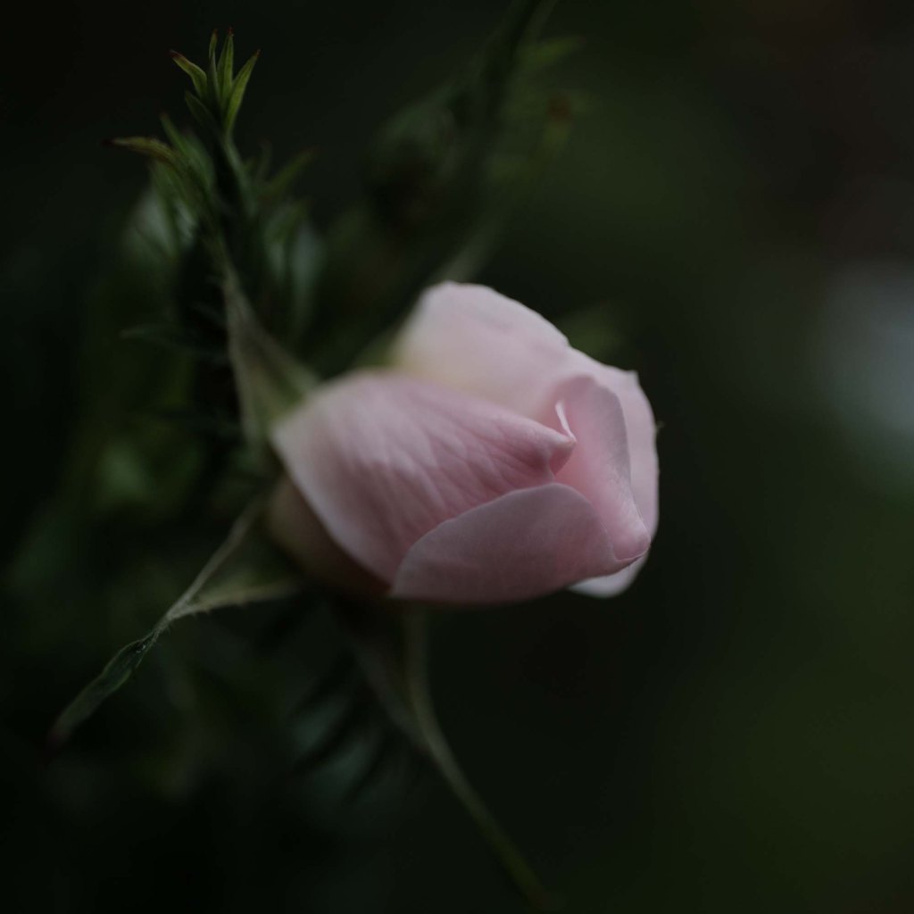
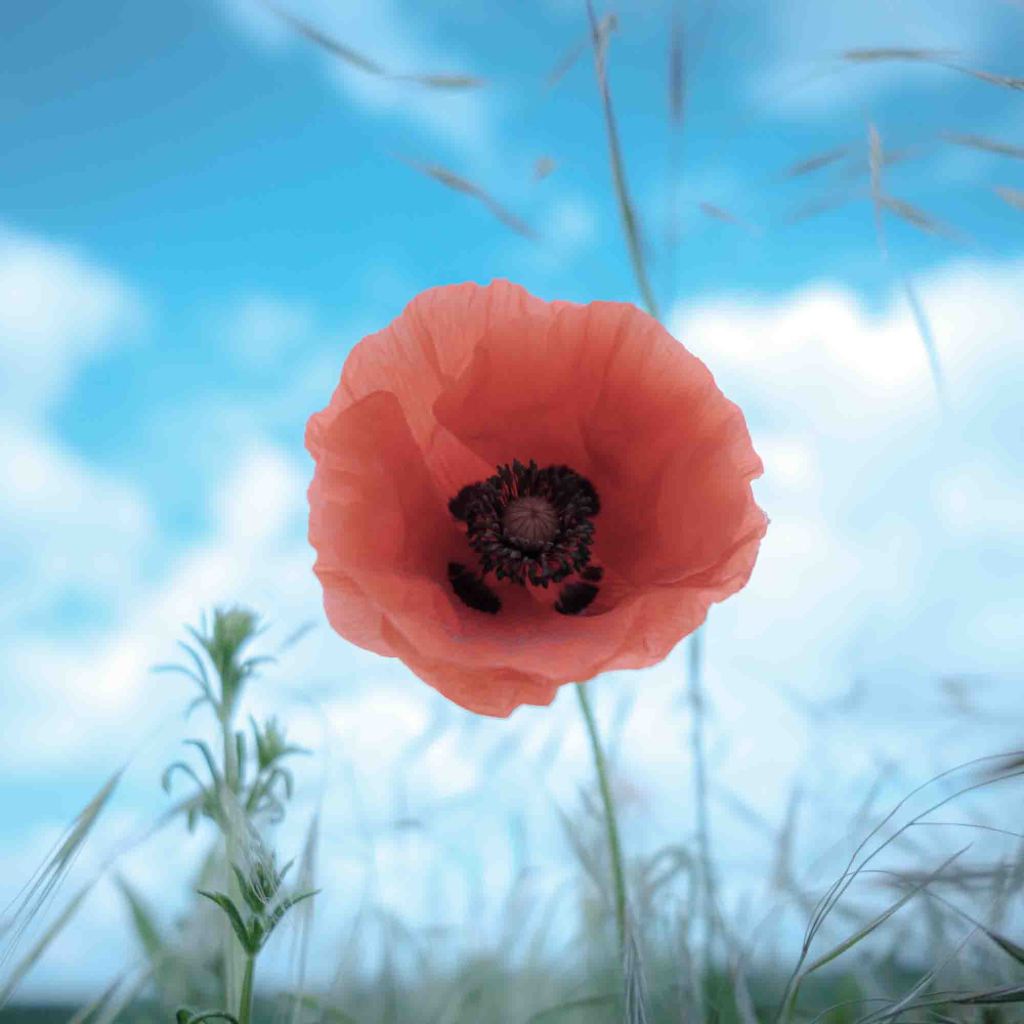
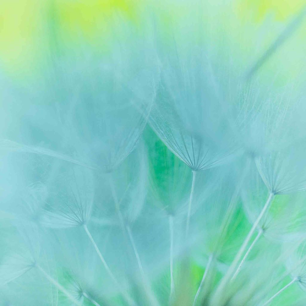
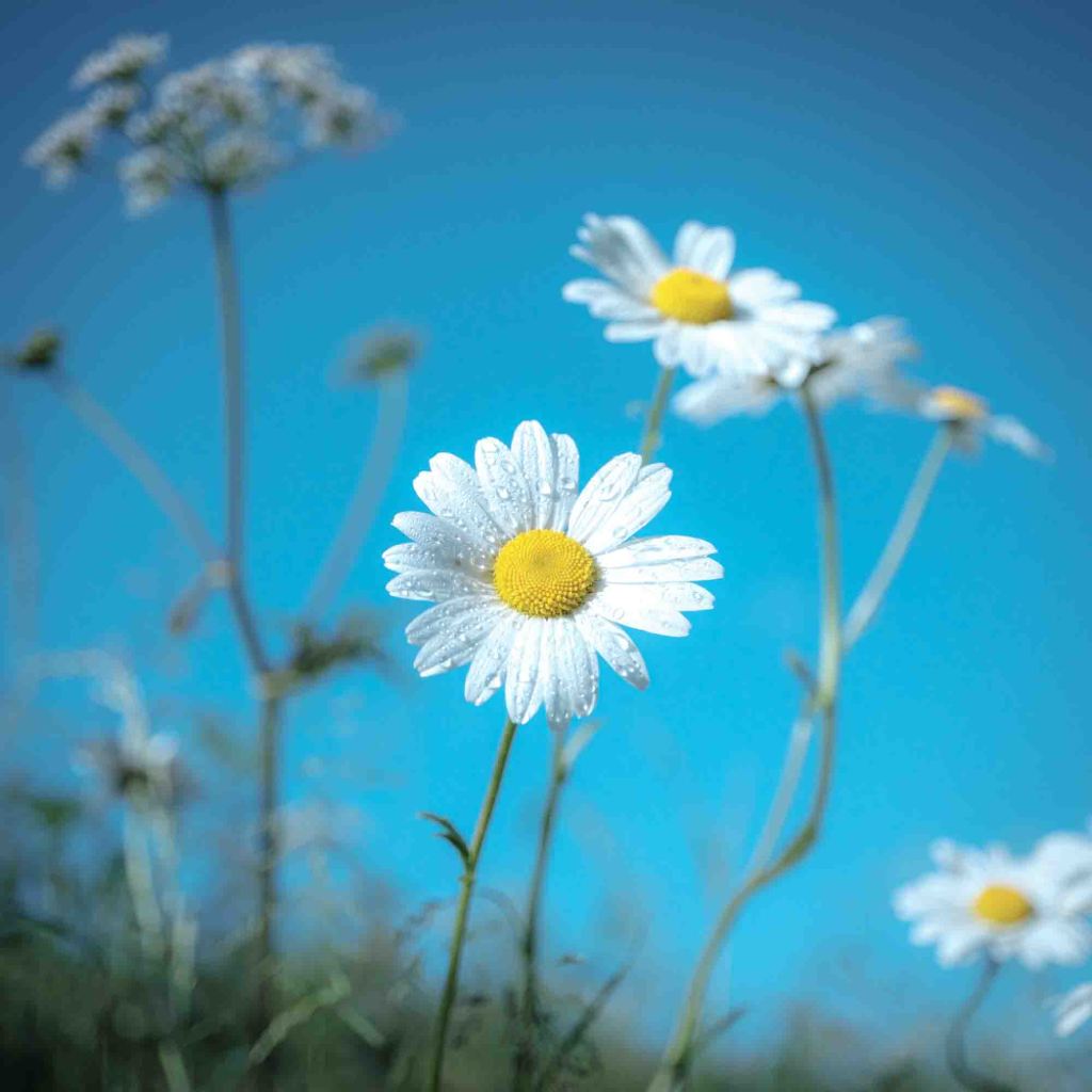
Flora (ongoing work)
Britain is home to over 1,500 species of wildflowers, ranging from the humble daisy to the rare lady’s slipper orchid. Most are diminutive and only reveal their beauty and fragility under a macro lens.
This diversity can be attributed to the varied climates and habitats found across the country. The moorlands, meadows, woodlands, wetlands, and coastal cliffs all provide unique environments where different species can thrive.
Unfortunately, wildflowers and plants in Britain face numerous threats, primarily from human activities. Intensive farming, urban development, and climate change have led to a dramatic decline in natural habitats. According to the charity Plantlife, nearly 97% of the UK’s wildflower meadows have been lost since the 1930s. This loss has had a devastating impact on the species that depend on these habitats.
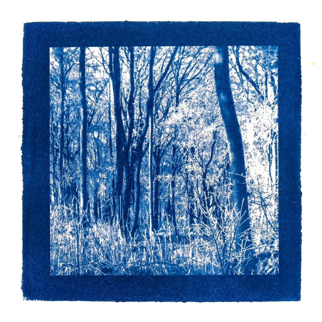
Cyanotypes (ongoing work)
I am also interested in alternative photographic practices. Cyanotype (AKA the blueprint) is an early form of reproducing an image, developed by Sir John Hershel in 1840.
Hershel used ferric ammonium citrate and potassium ferricyanide which, when combined create a light-sensitive solution that is applied to paper (and other materials) and dried in the dark. Objects placed on top of the sensitised paper, including contact negatives, when exposed to UV light (sunlight) will produce a contact print. The exposed imaged is developed in water to reveal a Prussian blue image. A final rinse with hydrogen peroxide will deepen the blue further. vegetable dyes (anthotypes) can also be used to develop or tone.
Anna Atkins, an English botanist was the first person to illustrate a book with photographs and she used cyanotype to do so. Photographs of British Algae: Cyanotype Impressions (1843) is held in the Natural History Museum’s library and special collections.
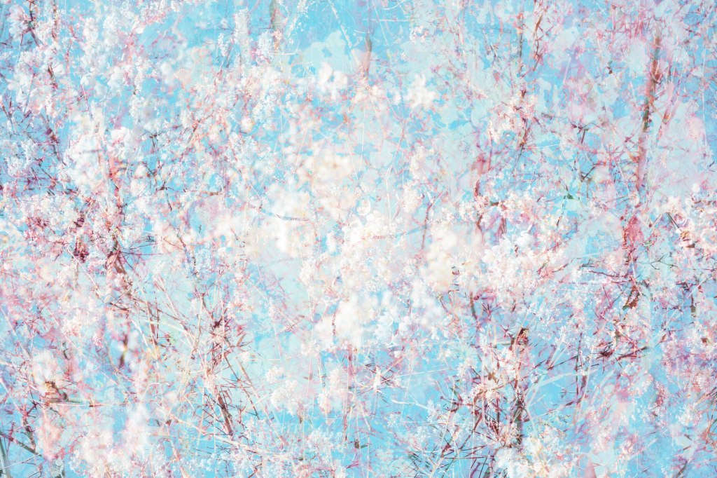
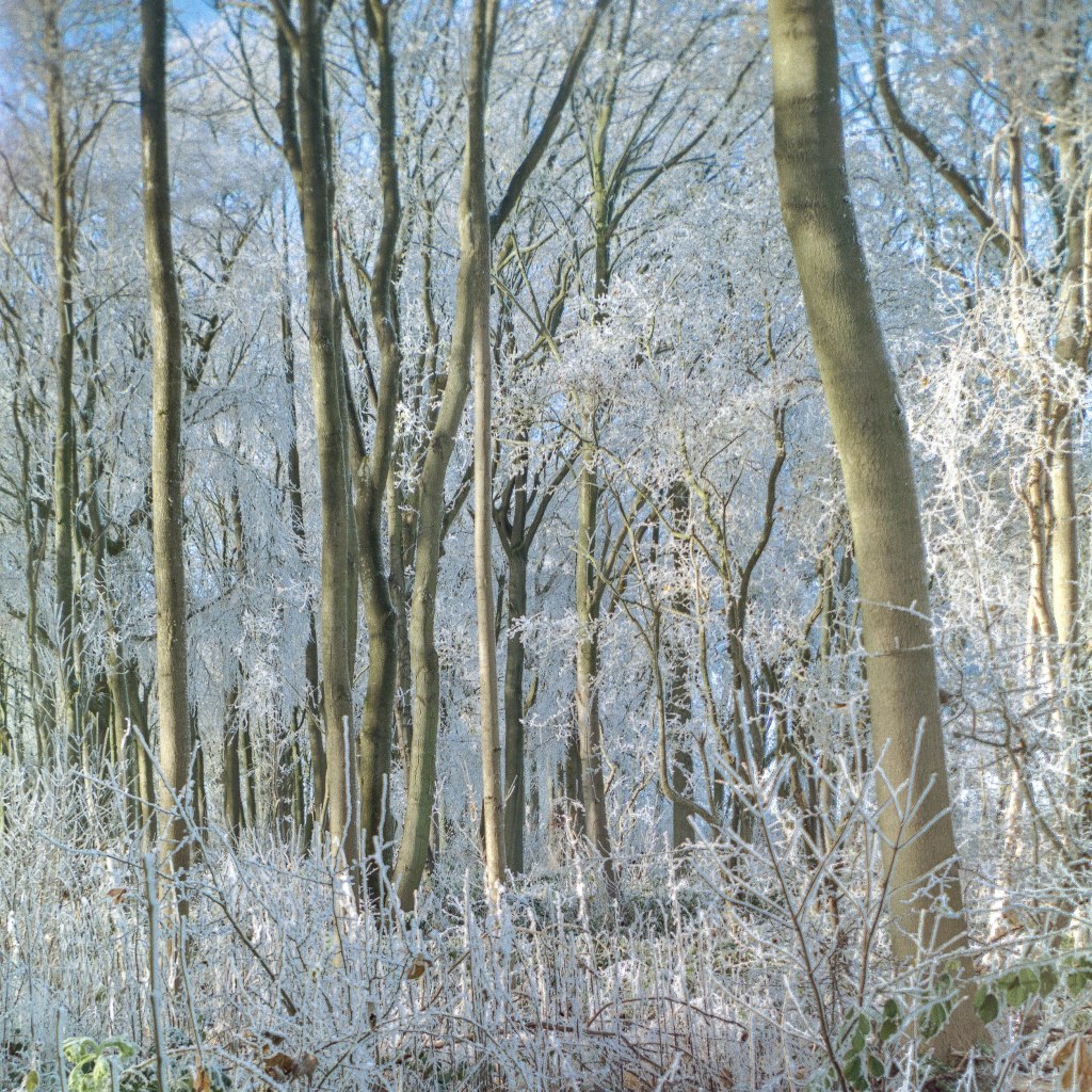
Cyanotype is not an obvious choice for landscape and that was not my initial intention. I was experimenting with a Kodak Hawkeye (Brownie) No 2 from about 1930 and 120 film on a winters morning heavy with hoar frost. The No 2 is a slightly more advanced Brownie, metal body rather than cardboard and three apertures f:11, f:22 and f:32. The shutter speed is fixed at around 1/50 and the meniscus lens is 80mm (medium format). It has two tripod mounts and used carefully is capable of taking very good photographs.
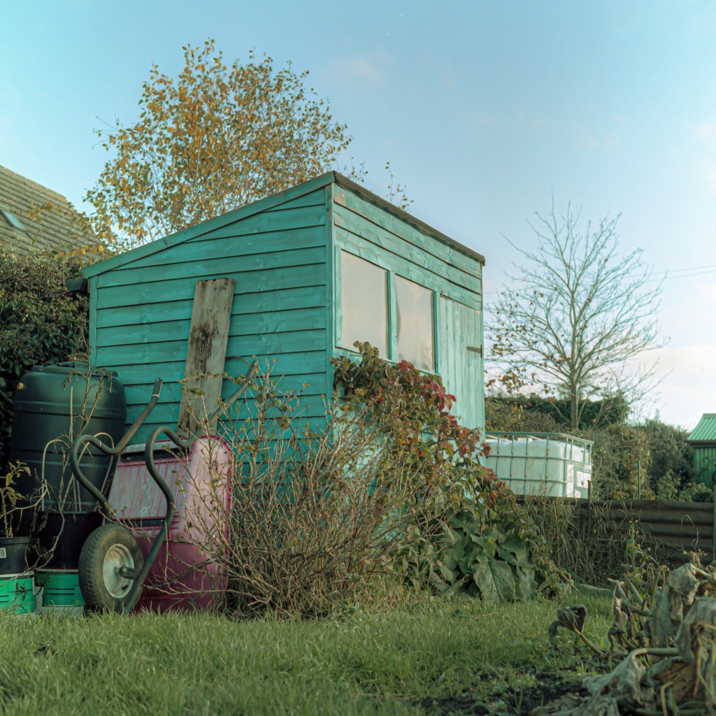
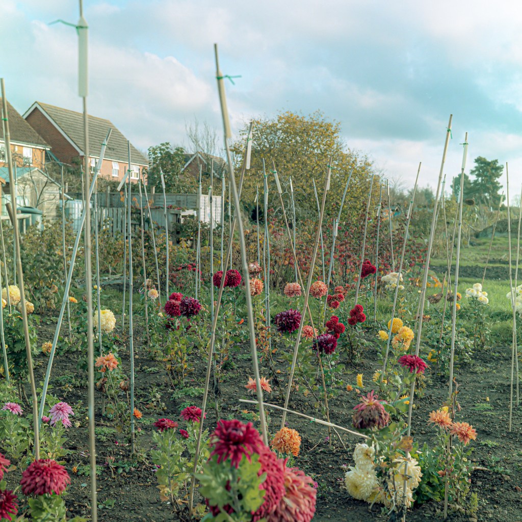
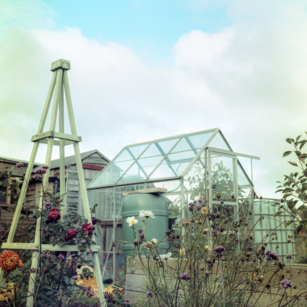
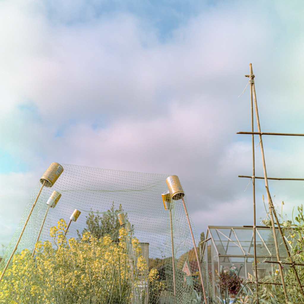
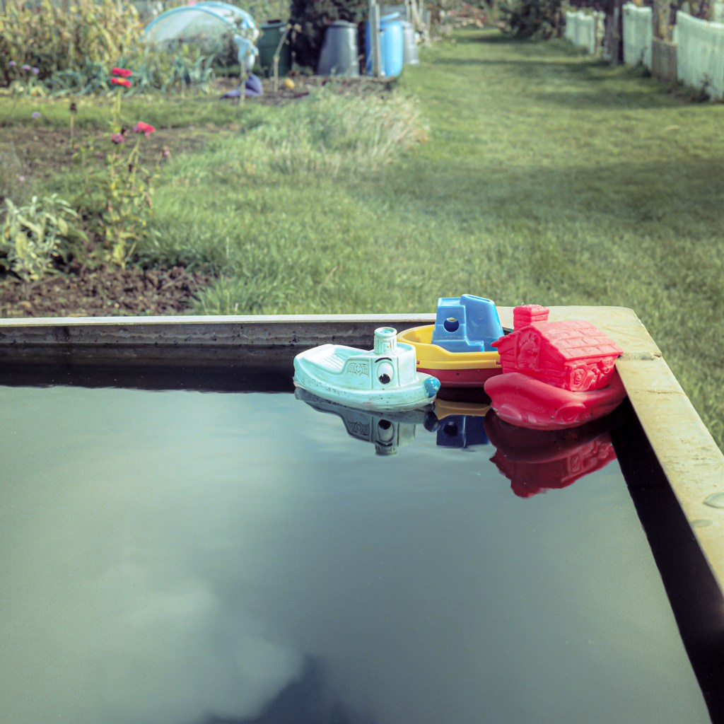
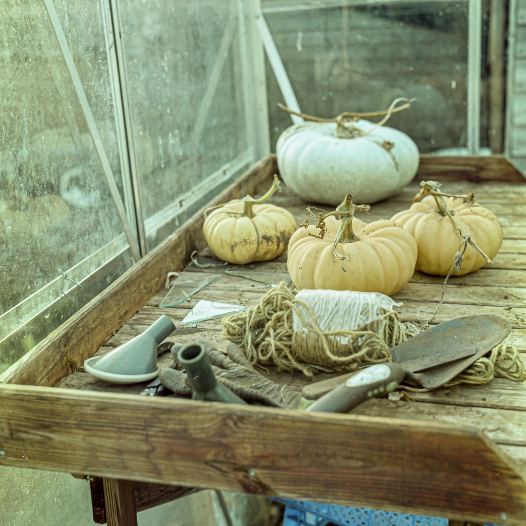
Allotments
50% of the world’s population, 70% in Europe, live in urban areas. 1 in 4 adults are likely to suffer some form of mental illness and this is 38% more likely to occur in urban areas. All my life I have felt most peaceful and relaxed in quiet places outdoors; unfortunately, green spaces are reducing in urban areas, yet these ‘lungs’ perform a vital function in our mental health and wellbeing.
Allotments are a vital part of this green fabric, and university studies point to lower levels of fatigue, depression, tension and anger amongst people who work an allotment – just 30 minutes a week is beneficial.
As a photographer I am naturally drawn to quiet still life moments and this is what these photographs convey – moments of peace in busy lives, a moment to pause and reflect. Photographing with a 1955 Minolta Autocord TLR and Kodak Portra film ensured that I too, slowed down and immersed myself in the peace and quiet.
This work is featured in ARTDOC photography magazine:
The Unobserved Online Photo Exhibition by Artdoc Photography Magazine
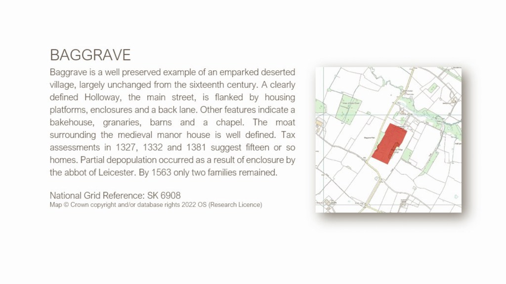
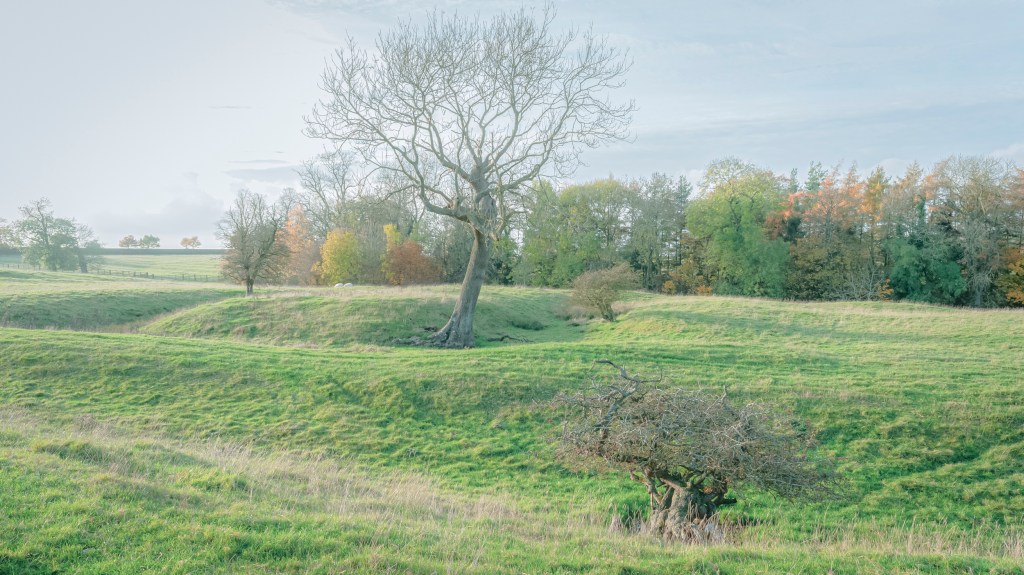
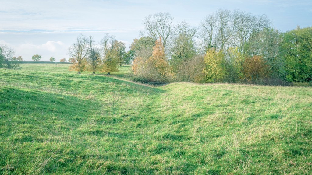
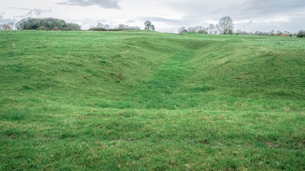
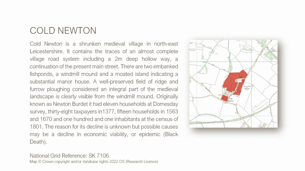
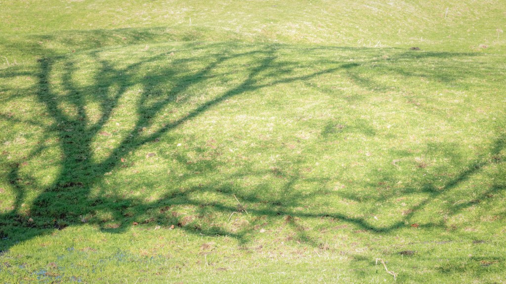
Medieval Villages Of Leicestershire
There are dozens of medieval village sites in Leicestershire. All long abandoned for any number of reasons: enclosure, plague, economic viability, some were simply built in the ‘wrong’ place, on poor soil and as farming tools and techniques progressed villages could move to more profitable land. A handful of villages remained on their original sites and expanded with new dwellings and tracks to replace the original geography which gradually settled into a collection of hollow ways and mounds seen most easily from the air.
This work is a photographic response that questions how we own and use land and the traces that remain when for whatever reason, people absent themselves. Each photograph invites the view to study the visible topology and consider the history behind each village. Detail and definition soften over the years but close inspection reveals lanes and channels, moated mounds and raised housing mounds that produce a constructed and managed landscape.
Aerial photography is the standard archaeological viewpoint for these sites, but exploration at ground level, especially in the winter, reveals much detail. It is also fascinating to tread ‘streets’ where once small communities worked and lived. These photographs are a retrospective of our rural past, two to three hundred years before the industrial revolution changed the work-place dynamic forever.
Some of these village sites, part of our heritage and history and once home to little communities are on private land with no public access.
This body of work was for my final degree year and received a mark of 72%.